Green Score
The Green Score provide aggregated, quantitative data about the performance and behavior of an API over time. It is an aggregation of static and dynamic values that are coming from the usage of routes in Otoroshi. The main objective is to advise users on the consumption of their APIs and services.
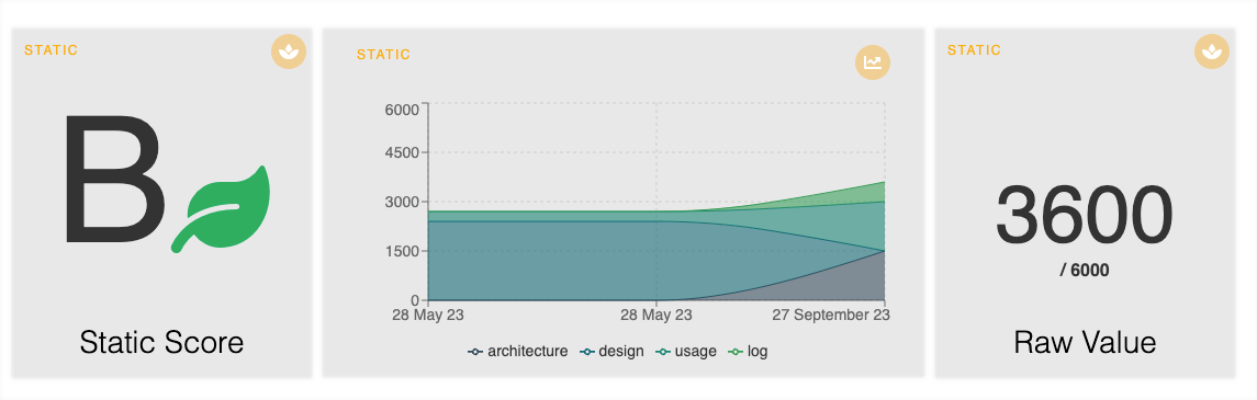
Otoroshi has a complete integration of the collective rules, divided into four concerns: Architecture, Design, Usage and Logs retention. The 6000 score points are spread over the four parts and a final note is given for each group of routes.
The API green score is available on 16.9.0 or later version of Otoroshi. You can find the feature on the search bar of your Otoroshi UI or directly in the sidebar by clicking on Green score.
To start the process, click on Add New Group, give a name and select a first route to audit. After clicking on the hammer icon, you can select the rules respected by your route. Before saving, you can adjust the values used to calculate the dynamic score. These thresholds are used to calculate a second green score depending on the amount of data you want not to exceed from your downstream service and the following other values:
- Overhead: Otoroshi’s calculation time to handle the request and response
- Duration: the complete duration from the recpetion of the request by Otoroshi until the client gets a response
- Backend duration: the time required for downstream service to respond to Otoroshi
- Calls: the rate of calls by seconds
- Data in: the amount of data received by the downstream service
- Data out: the amount of data produced by the downstream service
- Headers in: the amount of headers received by the downstream service
- Headers out: the amount of headers produced by the downstream service
The Green Score works for all architectures, including simple leader or more advanced concept like clustering.
efficiency
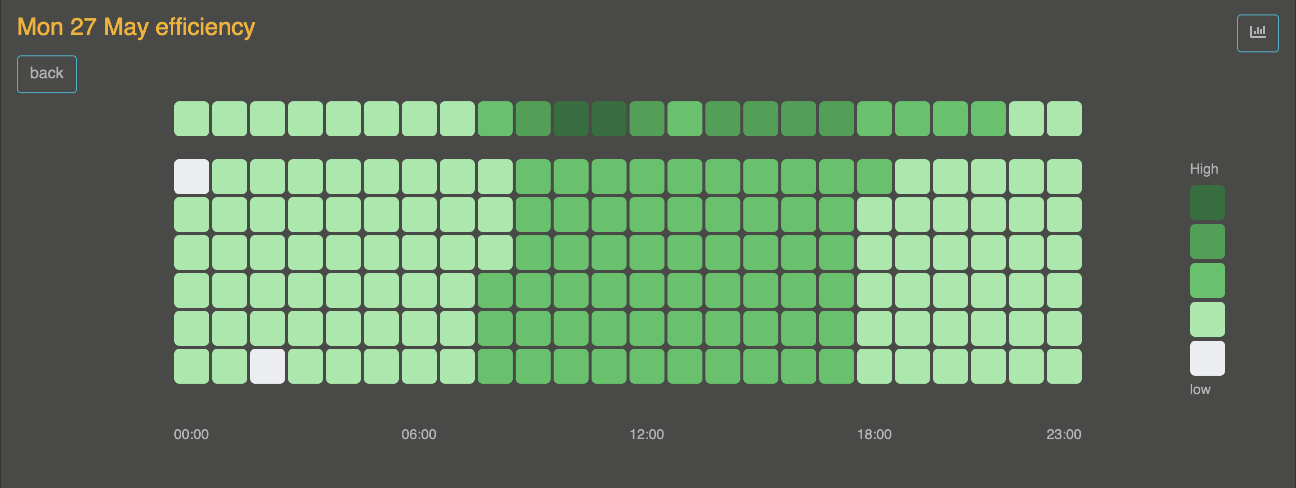
In addition to a performance calculation, the green score also provide a view to display the number of hits of selected APIs in a defined time interval. By default data are displayed for the last 7 days with an interval of one hour. On hover, you can see the number of hits and the average usage time (calculate with the average duration).
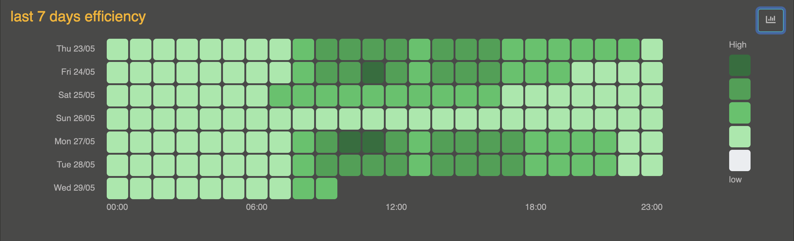
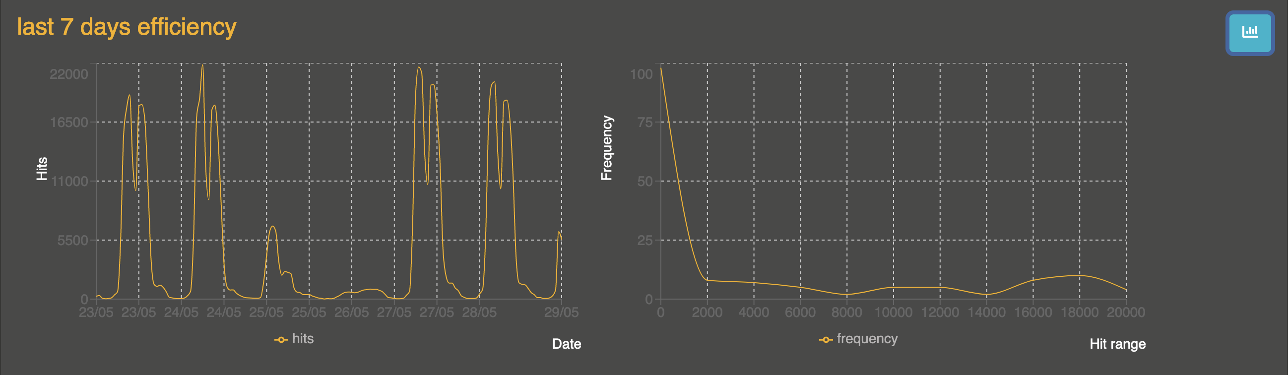
By clicking on the graph button in the upper right corner, an alternative view allows you to visualize the data using 2 graphs including a frequency graph.
By clicking on the day in the legend, data is retrieved for the selected day with an interval of 10 minutes. The scale of the 7 last days is kept, in the top, the selected days is displayed.